Stage One - Reviewing your work so far
I laid out my work that I had done this year and I was surprised with the amount that I had done. I felt that I enjoyed the printing projects and I was surprised that I felt the sewing part was another project that I enjoyed. So I kept this in mind when doing this project.
Stage Two - Focusing on your themed book
I looked through my sketch book and found a number of images that draw my attention so I did 4 large drawing from these images. I tried to experiment with materials and create texture in the drawings.


Stage 3 - Developing your design
I then did some close up of detail from my drawings in my sketch book.


From the work I did above I started to develop some ideas and made some samples to see what would work and what wouldn't.


While doing these samples I started to think about the final design. At first I was going to do a wall hanging. Then I started to think about interiors and that lead to a cushion that would look good in a living room or bedroom. Also a design that could be used on curtains and lampshades.


Stage 4 - Making your textile piece
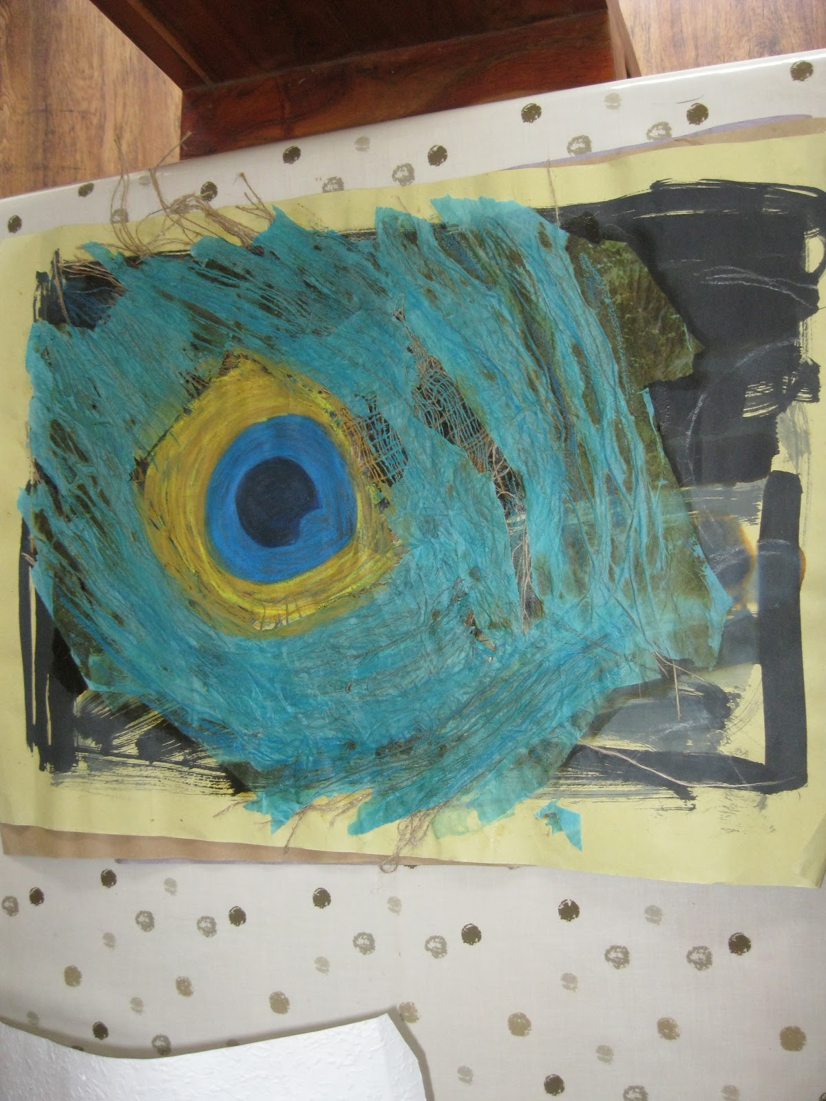
I finally came up with a design that I liked. It is based on the large Jay feather drawing that I did. The lines in the drawing I thought would look good done in stitch and I liked the colours and I could see it in my bedroom on curtains, lampshades etc...

Here is a close up of the drawing I worked from.

In this photo is the painted fabric using the Jay feather colours. This was my first attempt on poly cotton. I chose this fabric as I wanted a light fabric as feathers are light. But when I tried sewing on it I found that the material puckered and ran a little. So it was not going to hold the amount of stitching that I wanted to do. I ended up using Calico as it took fabric paint well and it was strong enough to take the amount of stitching that was needed for the design.

Here is the sample I did of stitching on the different materials and the painted fabric.

And this is my final finished design made. It has the jay feather pattern on the front and a pleated net fabric on the back that has the printed fabric underneath. I chose to pleat the back as I was thinking of all the lines of the feather and I felt that it gave the cushion a more 3 dimension feel as you have a front and back to look at. Also I feel that the cushion has a tacktile feel that I always like to get into my work. I am please with the finished piece and have thought of other designs that I could do from the other feathers that I drew.

Front

Detail of front
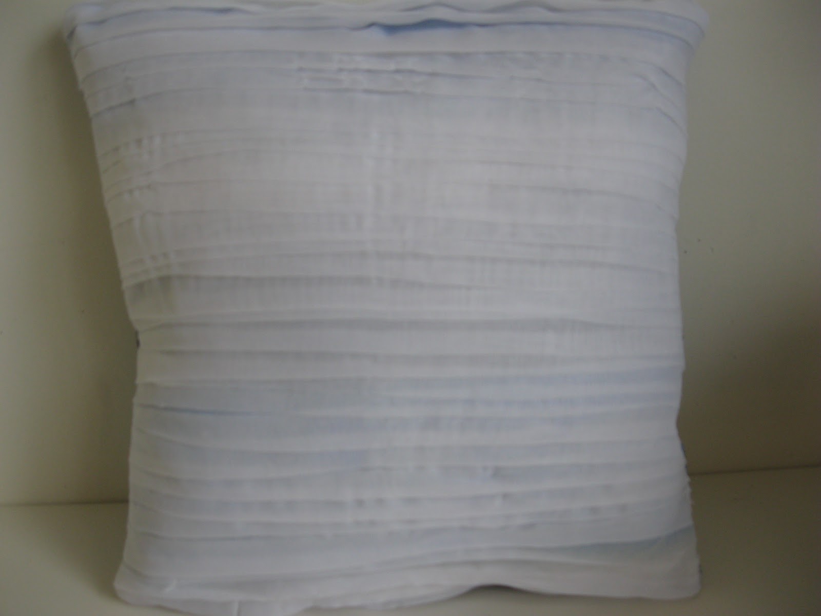
Back


